Business Card Printing - A Comprehensive Guide
Welcome back for another Lightning Prints blog post! Today, we’re talking business name cards. It is a necessity for every business/ brand to have a business card. Even in today’s digital age, you still find business cards being frequently used.
You see a wider variety of business cards today than you did 10 years ago. Some companies are even customising employees’ business cards with their own quotes or photos. But today, we’re going to talk about the basics of business card printing and design. Ironically, let’s begin with the different types of finishes you can opt for.
Finishing
There are a couple of different finishes you can choose from for your business cards. We’ll be covering the 4 most common finishes.
1. Varnish
Firstly, Varnish. This is one of the most common finishes for business cards. A varnish finish is a coating of either matte, silk or gloss that’s applied to the card. This layer also protects the paper and allows for the cards to last longer. A business card with a varnish finish looks shiny and will have a plastic feel to it.
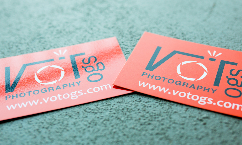
Source: Nobleus
2. Die-Cut
Next up, Die Cut. If rectangular business cards are too mainstream for you, die cut’s the finish you’re looking for! Choose another shape or shapes of objects that best represent your company. Say you’re running dental clinic, you can opt for a tooth-shaped business card. Your business card will surely stand out from a bunch of rectangular ones!

Source: Pinterest
3. Folded Business Cards
Folded business cards. You need not limit your business cards to only 2 surfaces. Consider getting a folded or semi-folded business card. This will automatically give you more surface area that you can use to include more information about your brand/ business.
Source: Pinterest
4. Embossing and Debossing
Embossed and debossed finish. Embossing is created by pressing on the card using heat. What this process does is it creates a raised pattern resulting in a strong texture. Depending on the design embossed, it can create a 3D effect on your business card.

Source: Pinterest
Debossing on the other hand results in the opposite effect. Instead of creating a raised pattern, the pattern is sunk into the card. Just be mindful of your design before embossing or debossing.

Source: Pinterest
Sizes
If you’re wondering how big your business card should be, use the standard size as a guideline. Standard business cards measure 3.5 x 2 inches. If you’re thinking of getting a bigger card or a die-cut business card, try not to go for a size that’s too big. We wouldn’t recommend anything that’s wider than 4 inches.
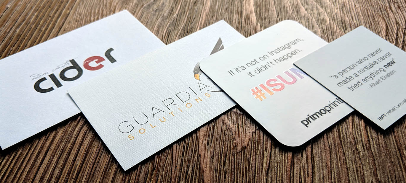
Source: Pinterest
For folded business cards, the 4 inches should be the dimensions when the card is folded, not opened. The reason for this size is, people tend to keep business cards in their wallets or a card slot. Too big of a business card, who knows where yours will end up.
Material: Paper Grammage
Paper grammage refers to its thickness. It is measured in GSM (grams per square metre). The type of paper that’s commonly used for business cards is art paper and they come in varying thickness. The paper you use for your business card should not be flimsy or easily torn. We’d recommend upwards of 230 GSM.
If you’re printing folded business cards, it would differ slightly. For these, you should go for papers that are between 170 - 300 GSM. A thinner choice of paper helps to ensure that when folded, your business card wouldn’t be too thick. Currently, we offer 2 types of thickness, 260gsm and 310gsm.
Design
For design, we’re going to focus on 4 elements; business information, fonts, colours & creative graphic imagery.
1. Business information (Front Side)
No business card is complete without the right information. This should make the front your card, which serves the purpose of telling people who you are, what you do, and how to contact you:
- Name of Individual
- Job Title
- Name of Company
- Contact number
- Email address
- Website
- Address (if you have a physical location)
- Social media handles (optional)
- Company slogan, QR code or other indication of what your business sells or does (optional).

Most importantly, ensure that you've proofread your business card design. Clear contact details, correct spelling and choosing a legible font in a readable size are all things that need to be triple checked. Make it easy for your customers to contact you the way they feel most comfortable.
2. Fonts
You should stick with fonts that are easy to read. Serif and sans serif fonts are perfect. Usually, sans serif fonts are used for the person’s or the company’s name whereas serif fonts are used for contact information. Feel free to switch it up depending on what works best for your brand. Just try to stay away from cursive fonts as it’s harder to read the words.
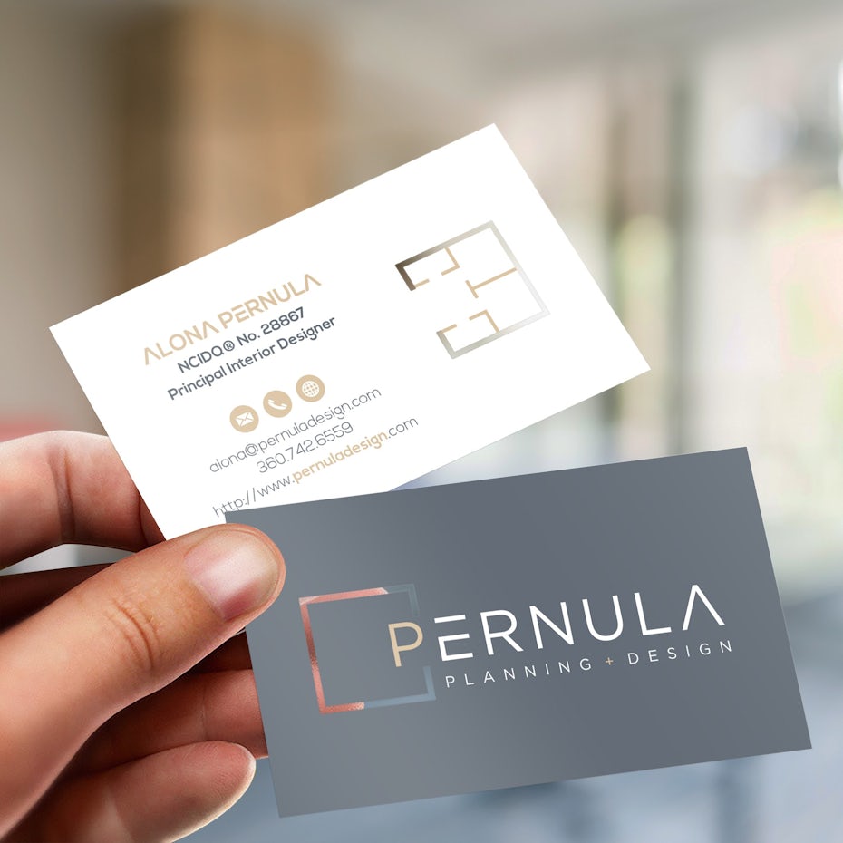
Source: Pinterest
Now in terms of font size. Using the standard size (3.5 x 2 inches), the size of your font should not be larger than 11pt and no smaller than 7pt. Usually the name on the card would be the largest text followed by the designation/ title and even smaller would be the address/contact information.
3. ColoursMoving on to colours & contrast. To maintain a consistent brand identity, colours of your business card should revolve around your logo or industry for a cohesive look. If you’re in the entertainment industry or are focused on anything dealing with children, consider vibrant and exciting colors.
Muted colors work well for more professional settings, like accountants or doctors, but remember — these options aren’t set in stone. Should you need a secondary colour for your business card, you can opt for a neutral colour. You should use a mix of light and dark colours to achieve the desired contrast. This will ensure maximum legibility of the copy on your business card.

Source: Pinterest
4. Creative Graphic Imagery (Reverse Side)
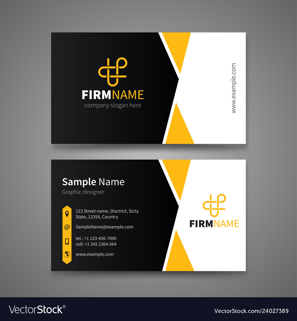
For the reverse side of your business card, you should include a creative graphic imagery that helps your customers recognise your brand. The most common use of graphics on a business card would be the company’s logo. You should ensure that the logo is clearly visible but do not make it too big. You can also choose to incorporate the use of patterns in your business cards as you see fit. As a rough guide, you should not use more than 2 graphics images on each side of your business card.
Source: Vectorstock
If you wish to include images of your product or service, do so with caution. Make sure you use a high resolution image with a DPI of 300 to avoid your cards looking blurry and unprofessional. To determine if your print resolution is sufficient, give our past blog What is the Correct Resolution of my Artwork a read!
Alternatively, you can get more uses out of your business cards by adding appointment reminders, loyalty stamps or even a handy calendar!
Final Thoughts
Business cards are reflection of who you are as a person and as a professional. Make it your own with help from Lightning Prints. We offer a full range of business card printing options sure to meet every need! Getting your order started is easy. Just upload your design to our website and upon receiving payment, our team will print your name card to order.
Not sure how to create a design? Email us a rough guideline from you on what you expect in the design at ask.lightningprints@gmail.com or arrange a quick chat with us today. Check out our business name cards today and start crafting the perfect card for your business!
And that is all we have for you today folks. We hope that you’ve learnt a thing or 2 from our comprehensive guide. Till the next time, cheers!

