Popular Fonts to use for Poster Prints
The typefaces you choose can have a huge impact on the way your brand communicates. After all, it's not just what you say: It's how you say it. By choosing fonts that reflect your brand's values—traditional or quirky, fun or formal—you can attract the right kind of customers.
In today's episode of Lightning Prints blog, we've compiled 8 popular font combinations to help give you a little inspiration when getting started on creating your own poster prints for your brand. All of these fonts are included for free for download.
Understand the personality traits of each font category
If you’re not a typography nerd, you might not be familiar with the idea of font categories. But they can be a good place to start your search for the perfect brand fonts. There are 4 basic font classifications:
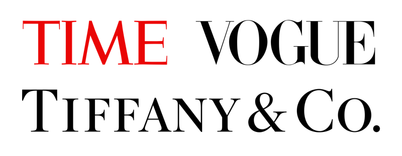
Serif Fonts
They’re named for the feet (called serifs) seen at the top and bottom of each letter.

We generally perceive them as classic, traditional, and trustworthy. They’re favored by brands that want to convey a feeling of respectability and tradition, like Tiffany & Co, Vogue, and Time Magazine.
Sans-Serif
Sans-serif fonts do not have feet (serifs), unlike their serif counterparts. Since they are simpler in design, they tend to evoke a sense of cleanliness and minimalism.

Sans-serif fonts have taken over the web in recent years, with many of the top tech companies choosing bold sans-serif brand fonts:

Slab Serifs
Slab serifs, a special breed of serif fonts, feature larger, blockier serifs. As a result, they look a bit more rugged, bold, and quirky than traditional serif fonts.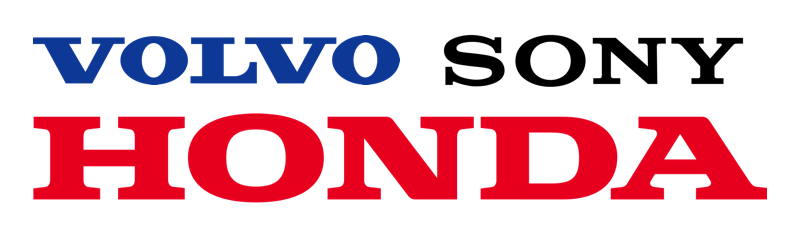
Script
Script fonts are designed to imitate cursive handwriting, have character strokes that connect one letter to the next. They’re a fun choice if you want to present yourself as a playful, informal, approachable, or artistic brand.
They tend to follow the design trends of the day, making script fonts a risky choice for a brand font, as they might fall out of fashion too quickly. Still, the script fonts used by brands like Ford, Johnson & Johnson, Cadillac, and Instagram have stood the test of time (so far):

Pick a pair of brand fonts that match with your brand personality
Once you’re familiar with your brand personality and you’ve got a handle on the different font categories, you should be ready to try out some fonts for your brand. So let’s look at some font pairing schemes that work for different brand personalities.
1. League Spartan

It is a slab serif font that features a bold, geometric design in a single, strong weight. Works well with dynamic businesses like tech and athletic companies who want to portray daring, quirky and confident brand personalities.
Best Paired with: Libre Baskerville. This elegant and more traditional font contrasts well against the style of League Spartan, creating an approachable yet trustworthy feel.
Great for: Corporate Poster Prints and Retail Poster Prints.

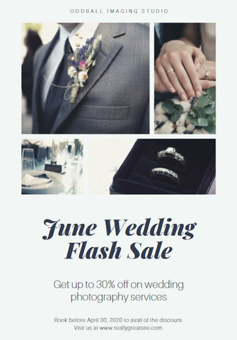
2. Fairplay Display Black

It is a serif font that features high-contrasting letters with delicate lines, creating a high-end and elegant feel. Works well with traditional businesses like luxury retailers who want to portray sophisticated and glamorous brand personalities.
Best Paired with: Aileron Thin. The heavy style of Playfair Display Black offsets beautifully against Aileron Thin, creating a modern and professional look.
Great for: Wedding Display Posters, Event Posters and Luxury Retail Posters Prints.
Mock-up Image:
3. Yellowtail

It is a script font featuring connected letterforms and slanted strokes, creating a playful, affordable and youthful vibe. Matches well with kid-focused, inclusive businesses like daycares or restaurants with trendy, friendly and exciting brand personalities.
Best Paired: Open Sans Bold. Yellowtail contrasts nicely against the bold and more basic style of Open Sans Bold.
Great for: Fundraiser Posters, School Posters, F&B Poster Displays and Concert/Festival Posters.
Mock-up Image:

4. Bodoni Bold

Another slab serif font designed to give an impression of luxuriousness. Perfect for modern, high-end headlines. Like PlayFair Display Black, it works well with companies with an upper-class brand personality.
Best Paired with: Montserrat. Bodoni Bold paired with the minimalistic Montserrat creates a sophisticated and contemporary look.
Great for: Fashion Retail and Editorial Poster Prints.
Mock-up Image:

5. Libre Baskerville

A classic, serif font that is versatile design with multiple weights, which lends itself perfectly to any no-nonsense heading. Works well across conventional businesses that want to convey reliability and trustworthy-ness.
Best Paired with: Libre Baskerville Regular. Finding fonts like Libre Baskerville that have style variants is a clever way to create nuance without overcomplicating your designs.
Great for: Campaign Posters, Advertising Posters, Exhibition Posters and Conference Posters.
Mock-up Image:

6. Cinzel

A serif font that features a vintage but classy and contemporary typeface. Letters are thin, which makes the font striking and prestigious-looking. Works well for businesses who look to portray themselves as polished and expensive.
Best Paired with: Quattrocento. With the delicate strokes of Quattrocento, this is a fine combination to use for headings.
Ideal for: Fine Dining Display Posters, Bar Posters and Hotel Posters.
Mock-up example:

7. Oswald

Best Paired with: Montserrat Light. This makes for a highly functional and easy to read font combination.
Ideal for: Corporate Poster, Informative Poster, Signage and Campaign Poster Prints.
Mock-up example:

8. Montserrat Hairline
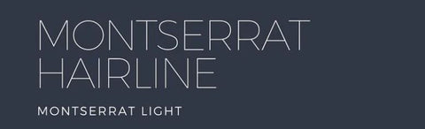
It is a san-serif font that features thin, clean and structured typeface, which create a sense of exclusivity and standard. Works for professional and corporate businesses that wish to evoke a sense of cleanliness and minimalism.
Best Paired with: Montserrat Light. This makes for a highly functional and easy to read font combination.
Ideal for: Corporate Poster, Educational Poster and Restaurant Display Poster Prints.
Mock-up example:
To create a memorable brand, you need to make sure every element of marketing design pairs well. That, of course, includes fonts for your poster prints.
Whether you're building your brand from scratch, reworking your logo or printing promotional materials, we're here to set you up with the right font choices—so you can put your best foot forward.
If you already have an idea on what to print and the size you want for your poster prints, head over to our page to place your orders now! In the meantime, give our previous posts a read!
Till the next one, cheers!