Colour Psychology - The Guide to Print Marketing
Colour is an absolute powerhouse when it comes to print marketing. Whether you realise it or not, your company’s logos, branding and other promotional printing efforts rely on colour as an asset to your messaging and designs.
On this week's Lightning Prints blog, we will assist you with which colour will help your print marketing efforts to thrive. This guide not only describes the psychology of each colour, but which colours compliment which, and which industry it’s best used for. By the end of this guide, you’ll be ready to design an influential print marketing campaign for you and your company!
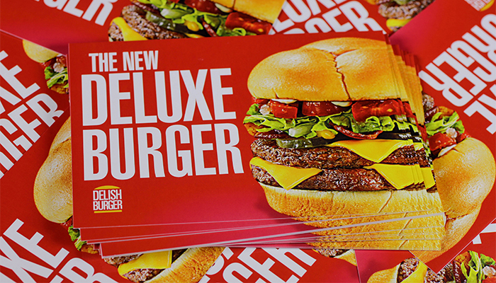
Red
Being a colour of strength, red evokes aggressiveness and power. It’s a colour that commands attention and brings about excitement. Red makes a good accent in logos and borders, making it ideal to include to use for headlines, subheads, contact info, and offers due to its loudness and the attention it draws in. It is known to stimulate hunger, drive sales, and make people feel fiery and passionate.
- Industry: Food/Restaurant, Retail (Sales), Romance, Clubs, Politics, News/Entertainment, Health
- Paired Best With: Orange, White, Medium Green, Black, Dark and Light Blue
Black
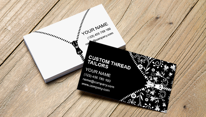
We tend to view Black as an authoritative colour. It demands respect because of the traditional association it carries. While it represents sleekness and class, it also is tied to feelings of fear, darkness and drama, thus we advise on using it appropriately.
That being said, black will hold out strong in business cards, posters, pull-up banner or any print material that heavily relies on text. It can fit into almost any design and makes other colours stand out. A simple black type on white paper is traditional, practical, and legible. So don’t be afraid to stick to classic standards if your print materials call for it.
- Industry: Traditional Corporate Businesses, Law Offices/Attorney, Accounting, Car Services, Formal Party Invitations, Fashion/Tailor, Limo/Car Service
- Paired Best With: White, Gray, Yellow, Red as an accent colour, Royal Blue – be careful with the proportions when mixing black with other colours
Blue
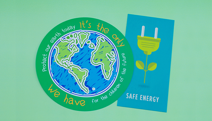
Blue psychologically reigns as being calming and intelligent. We can link this colour to trust, security and even fiscal responsibility. We trust Blue because it’s the colour of everything that is stable and permanent in the world, such as the ocean and the sky.
Furthermore, blue is stamped with a male gender identity, so males tend to be more pulled toward it. Consider this ideology when you are taking your targeted audience into consideration.
- Industry: Technology/Software, Medical/Pharmaceutical, Plumbing, Banks/Finance/Accounting, Politics/Government, Car Wash
- Paired Best With: Other various shades of Blue and cool tones, White, grabs attention and boldness with Yellow or Red, Purple, Gray
Brown
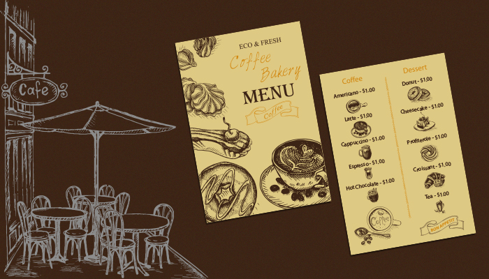
Another colour that derives from nature is the earth tone of Brown. Because of how dependable and consistent this colour is, it can be a feeling of ease and calmness when used in the right context.
It’s the colour of a lot of things that are natural, like dirt and wood, which makes it reliable due to its earthiness. You may want to consider this if your company is centered around trust, like a law firm or real estate. Aside from its “down-to-earth” feel, it can also be considered sophisticated and strong.
- Industry: Carpentry, Forestry, Organic/Eco, Gardening/Florist, Cafe/Coffee Shop, Industrial, Farming, Construction, Legal, Agriculture, Real Estate
- Paired Best With: Green, Yellow, White, Blue/Teal/Turquoise, Dark Purple, Gold, Orange, Pink
Green
Green is heavily associated with other emotions such as fertility and wealth. It’s considered a relaxing colour because it’s easy on the eyes. Because this colour goes hand-in-hand with nature, it’s the colour that many Eco-friendly and organic companies like to use.
However, don’t be afraid to use this colour if your brand is not related to nature or health. A darker green correlates with money and trust, so you can amplify your branding when you add in dark green if it has to do with financing, banking or anything fiscal.
- Industry: Finance/Banking, Vegan/Vegetarian, Organic/Eco, Nature, Health/Dieting, Gardening/Florist, Spas, Medical, Grocer/Farm, Parks and Rec, Agriculture, Recycling, Landscaping
- Paired Best With: Brown, Yellow, White, Red, Blue, Orange

Yellow
Does thinking of Yellow make you feel warm? Yellow is the colour of the sun, which represents warmth and happiness. It’s very inviting, making it a great colour for any call-to-action type campaign. It gets your brand noticed while remaining subtle.
However, just like the sun, Yellow can be quite overpowering if you use it too much. It does very well as an accent and enhancing it’s complementary colour, Purple. Due to its brightness, Yellow is often associated with cheerfulness and youth, so a lot of children’s companies take advantage of it in their branding.
- Industry: Children’s Toys and Clothing, Entertainment, Parks and Rec, Education, Food, Automative
- Paired Best With: Purple, Orange, Red, Brown, White, Green, Gold, Silver

Purple
Tradition links purple back to royalty, nobility, and the bourgeois. It’s also known as a symbol for magic and power. It has a certain mystic air to it because it derives from the combination of blue and red.
If you want your business to be flashy, pairing it with silver or gold colours can give it that boost of wealth and extravaganza. Because this colour is rare in nature, it works better with artistic and creative types.
- Industry: Psychics, Magicians, Clubs, Travel, Artist, Cosmetics, Fashion, Candy/Sweets
- Paired Best With: Black, Gray, Yellow, White, Gold, Silver, Pink
Pink
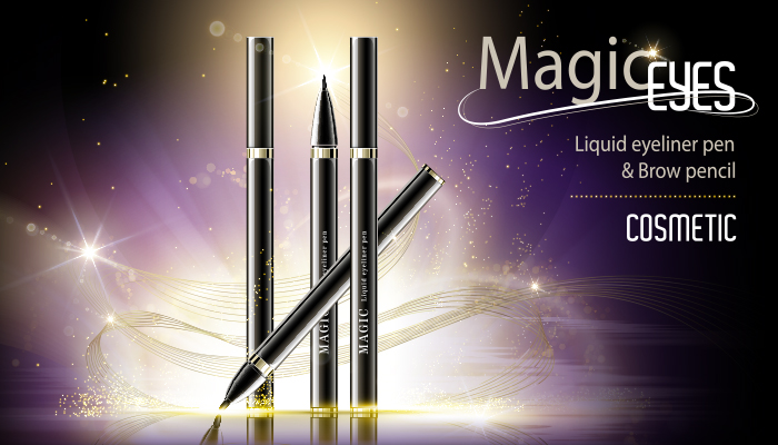
Pink is a sign of femininity, and we tend to think of “pretty” and gentle things when this colour comes to mind. We also associate it with love and romance. It is tender, gentle and caring. The lighter the pink, the more calm it feels. However, the darker the shade is, the louder and more attention grabbing it becomes.
Just as Blue is stamped as a sign of the male gender, Pink is stamped as a sign of the female gender. While it’s not always true to every person, it’s still an important ideology to keep in mind when considering your targeted audience.
- Industry: Women’s Health, Women’s Apparel, Girls Retailers, Clubs, Beauty/Cosmetics
- Paired Best with: Purple, Red, Black, Dark Green, Brown, Gray, Beige
White
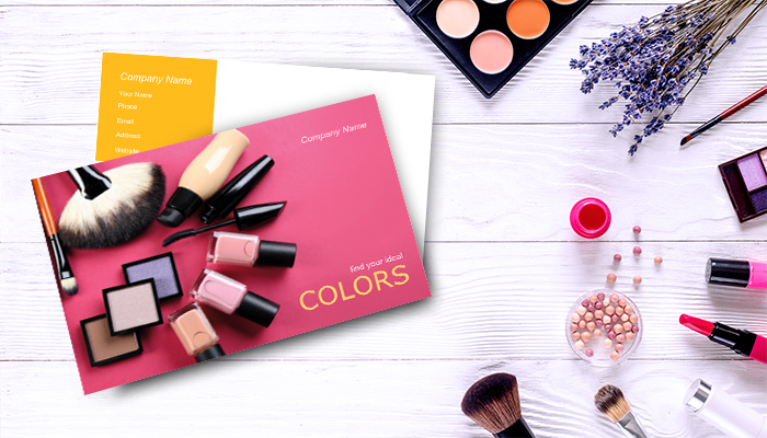
We can’t forget about white, a very traditional and neutral, yet necessary colour. It’s symbolic for purity, clarity, and starting fresh, as in a “clean slate.” It is sterile and clean which is why you’ll notice most hospitals, clinics and doctor’s offices to be white.
Most importantly, it’s the perfect complement to any colour because it takes away from unnecessary distractions and tones down colours that are loud and intense. Using a White background for print materials is the traditional go-to route, one you can hardly go wrong with.
- Industry: Medical/Hospitals, Wedding Planner, Dentist, Traditional Corporate Business
- Paired Best With: Dark colours like – Red, Black, Green, Orange, Purple, also used best as negative space
Colours & Printing
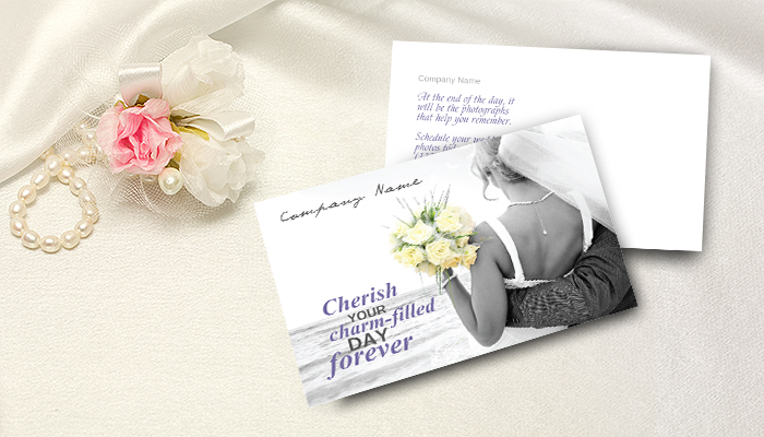
If you're interested in best-in-class colour printing, feel free to come to us at Lightning Prints! We put your needs first, our customer advocates help you choose the best method to keep your brand colours vibrant, accurate and in budget. Our reliable in-house production team and 10-ink spectrum colour printer will ensure your colour-sensitive printing gets done right!
For more information call us at: 98267596 or email us at: ask.lightningprints@gmail.com or fill up this contact form here!
Til' next time, cheers!
